
Overview
Taylor Stitch creates menswear with a long-term mindset: thoughtfully made, built to last, and crafted from more responsible materials. The goal isn’t to chase a season’s trend, but to create pieces that earn a permanent place in the wardrobe.
Its Shopify storefront brings together a broad product range – from shirts, sweaters, and bottoms to outerwear and accessories – alongside seasonal collections, fit guidance, and editorial content.
The challenge was to make that breadth feel effortless: help shoppers quickly understand what they’re buying, find the right fit, and feel confident about their choice, without adding friction to the path to purchase.
The Challenge
When the product has a story, the store has to tell it without slowing the shopper down.
Taylor Stitch doesn’t just sell garments. It sells construction, materials, fit, and sourcing. It sells the promise that a piece will hold up over time.
That’s a strong pitch. But it’s also a lot to sort through on the way to checkout.
Some visitors know what they want. Others are just browsing. A few already trust a specific fit or collection. The store had to work for all three, without splitting into three different experiences.
- How do I find the right product quickly?
- Which fit, fabric, or style is right for me?
- What makes this product different from another option?
- Can I understand the material and construction before buying?
- Where can I find sizing, fit guidance, care, and availability information?
- How do I move from browsing to checkout with confidence?
Editorial depth and shopping speed don’t usually mix well. The storefront needed both.
What We Focused On
01 – Smarter Product Discovery
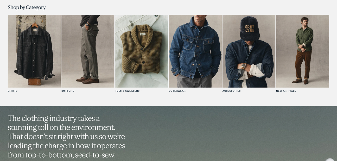
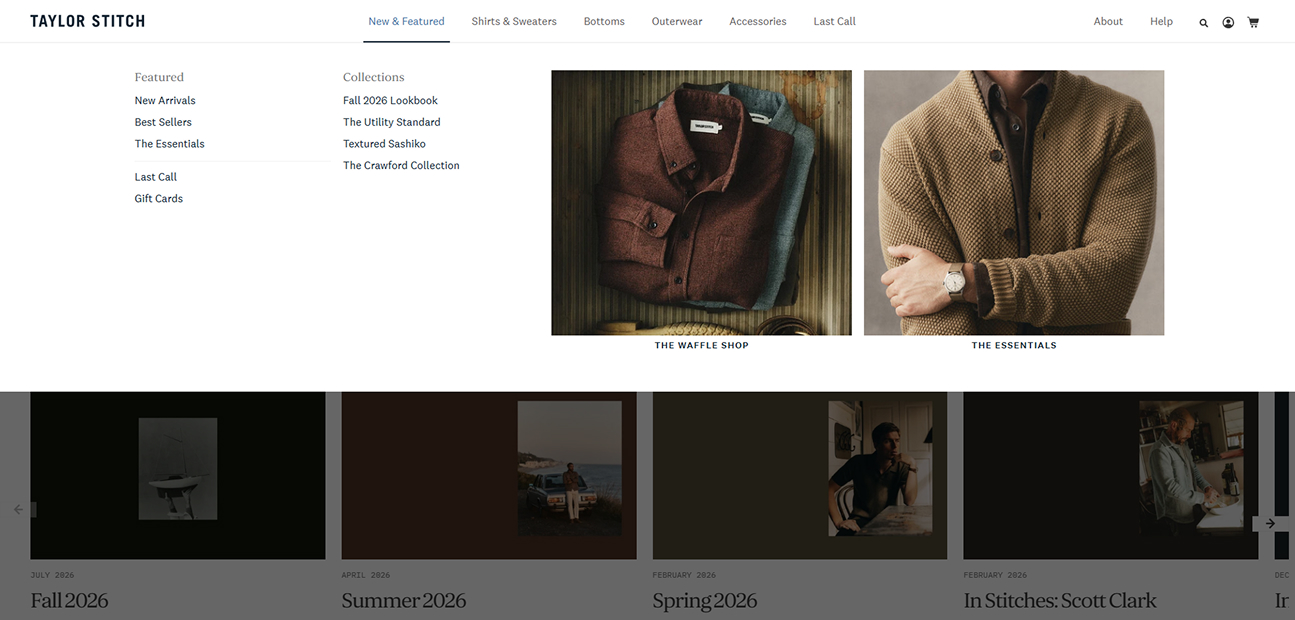
Taylor Stitch offers several ways in: by category, by collection, by fit, by what’s new. We made those entry points feel like one store, not four. So shoppers could browse the way they actually think about clothing.
02 – Product Pages That Explain the Why
A name and a price aren’t enough for a garment like this. Each product page is a place to decide. Fit, materials, and construction sit together instead of competing for space.
03 – Brand Story Without the Detour
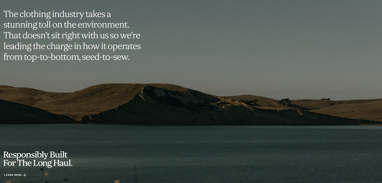
Taylor Stitch has a lot to say about responsible construction and materials. Buyers care about that. So we built it into the shopping experience itself, instead of parking it on an About page no one visits.
04 — Reducing Choice Friction
A big range only helps if people can find their way through it. Clear categories. Honest fit guidance. Calls to action placed where they’re actually needed. That turned a large assortment into something manageable.
Our Role
UX Strategy
We established the experience framework and key UX principles for the storefront.
UI Design
We developed the interface and visual language across the core shopping experience.
Product Storytelling
We shaped how product information and brand content come together across the storefront.
Information Architecture
We structured the relationship between categories, collections, products, fits, and content.
Shopify Development
We built and integrated the designed experience within Shopify.
Our Approach
We didn’t start by counting products. We started with how someone decides to buy: notice something, understand why it’s worth considering, check the fit, confirm the details, then buy.
That thinking shaped everything after it. Content hierarchy. Fit information. Where a call to action earns its spot on the page. The goal was to keep Taylor Stitch’s personality visible without slowing anyone down.
Show the product clearly. Explain its value. Remove the hesitation. Make the next step obvious.
Our Process
Discover
Reviewed the product range, category structure, fit considerations, and the different reasons shoppers arrive on the site.
Structure
Organized the experience around real shopping behaviour: browse, compare, check fit and materials, move to purchase.
Design
Gave photography, fabric detail, and key product information room to work, without cluttering the interface.
Optimize
Refined the path from discovery to checkout, without stripping out the storytelling along the way.
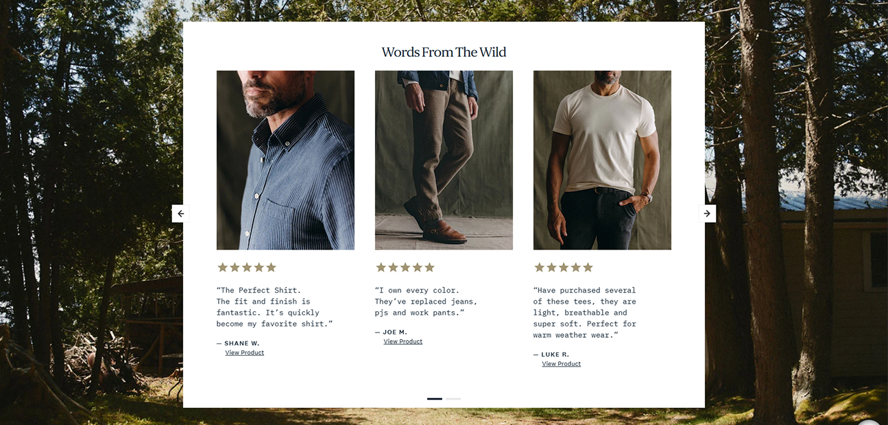
Transforming a Product Catalogue Into a Shopping Journey
Shirts & Shirting
Shirting is where the brand's heritage shows up most. Oxfords, casual shirts, short sleeves, flannels. Each silhouette gives shoppers a different way in.
Bottoms & Denim
Pants, chinos, jeans, shorts, and lounge pieces. Organized around how people actually dress day to day, with fit guidance to help narrow things down.
Outerwear
Jackets, coats, chore coats, shirt jackets. These give the store a bigger role in someone's rotation, without losing the brand's utility-first character.
Essentials & Collections
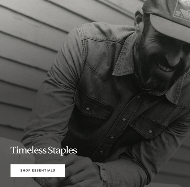
Evergreen pieces get returning shoppers back to their favourites fast. Curated collections give new shoppers a way into a specific aesthetic or story.
Fit, Fabric & Product Detail
Fit guides, materials, specs, and care details. They turn a browse into a decision, not a guess. The real challenge: make all that range feel like one collection. Not five unrelated categories.
What We Delivereds
UX/UI Design
An interface built around discovery, evaluation, storytelling, and conversion.
Shopify Website Design
An e-commerce experience shaped by the brand's product-first visual language.
Shopify Development
A storefront built to support discovery, content, responsive browsing, and purchase.
Information Architecture
A clearer relationship between categories, collections, fits, products, and content.
Product Storytelling
Materials, construction, fit, and purpose given a real role in the buying decision.
Conversion-Focused Journeys
A path from discovery to cart that doesn't fight the shopper along the way.
The Result
From a product catalogue to a more considered digital shopping experience.
Craftsmanship. Durability. Responsible materials. Fit. Timeless design. These now sit alongside the products themselves, instead of somewhere off to the side.
Shoppers no longer have to choose between the brand story and an efficient checkout. They can discover a collection, inspect a product, understand how it’s made, check the fit, and move toward purchase without losing the thread.
The real challenge was balance. A broad assortment. A brand with a lot to say about how its clothing is made. Every extra detail needed to help someone decide, not just fill space.
Good e-commerce doesn’t just help people buy. It helps them understand why they want to.
Have a Shopify Store That Needs More Than a Redesign?
Let’s turn product discovery into a better customer journey.
Whether you’re scaling a fashion catalogue, rebuilding a Shopify storefront, improving product discovery, or connecting brand storytelling with conversion, the right e-commerce experience can change how customers see your products.